Logos
They're everywhere – you see them but don't always notice them. They help us recognise big brands like Nike and Shell, but what about those more workman-like marks that are stuck on the bottom of our kettles or sewn into our jumpers? Let's have a look at some of those ubiquitous logos and their hidden beauty.
Keep motoring on
The MOT logo adorns many a garage but is rarely noticed as you zoom past listening to Steve Wright in the Afternoon (showing my age). It always seems obvious to me that the three triangles make an abstract M, O and T. The MOT was introduced in 1960, but the origins of the logo remain a mystery to me. Safe to say the 56-year-old logo needs no brand refresh. It is not the prettiest symbol in the world – perhaps a bit alien-like – but it's here to stay.
Handy
The ubiquitous motorway service station device, the World Dryer. Sitting on the top of this iconic unit is an interesting and much overlooked swirling W and D logo. Famous for drying Madonna's armpits, the World Dryer has gently blown air across the hands of millions of people. Until Mr Dyson came along and blasted them out of the water, so to speak. Dyson's logo already looks dated: World Dryer's should never change.
The kitemark
The British Standards Institution's logo is a symbol of safety and quality. Created in 1903 it features an uppercase B (for British) on its back, over an S (for standard), enclosed by a V (for verification) – not a lot of people know that. I've seen a new version on the back of a van, where they have filled in the shape and left a 'bottom' sitting on a triangle. Progress, eh?
A masterpiece
Designed with a pencil, this a masterpiece. Designed by the Italian Francesco Sarogli in 1964, he'd be turning in his grave if he saw the derivative 'Wool blend' logo that some mug bastardised. Mr Sarogli was not a designer – he was an employee who was on the judging panel of a competition to design the logo. On seeing the entries he decided to have a crack himself. Stroll on. The balance of line weight is exceptional.
Recycling
The 23-year-old Gary Anderson, an American engineering student, entered the competition to design the recycling logo in 1970. His prize? $2,000 and the pleasure of seeing his concept plastered on every recycling bin across the globe. Its origins come from the arrows being 'folded', like pieces of paper. Can you imagine what it would have lost using curved arrows? It needs no description, no drop shadow – nothing. It does what it says on the tin, without actually saying it.
British Rail
In 1964 the Design Research Unit, apparently Britian's first multi-disciplinary design agency, tackled the problem of branding British Rail. The result is the 'double arrow', a mark that communicates rail tracks and a two-way journey in what is really only three lines. Coupled with Jock Kinneir and Margaret Calvert's font 'Rail Alphabet' – the duo were also reponsible for the font used on every road sign in the UK – the idenitiy has outlived the lifespan of what was our national rail network. The logo even has its own website.
Some things do need to change
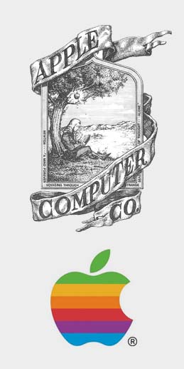
Apple: one of the biggest brands in the world, if not the biggest. Back in the day (1976), their original logo was designed by Ronald Wayne Well – horrific. His ideas was to illustrate Newton's moment of realisation. But this is 1976, not 1687 and this 'book plate' style was never going to work.
A year later Rob Janoff designed the multi-coloured apple with a bite taken out of it. The logo has gone to inform every iteration since. It is not a logo that goes unmissed or unseen, I realise that. But it should be remembered that a logo with six colours was a very expensive decision at the time, and one that proved to be iconic. Since its initial revision, the logo hasn't changed very much at all really. It went through a 3D stage, but didn't we all?
Before we go
Anybody can argue that the Union Jack isn't a logo. But it is Britain's greatest symbol and in my opinion the best flag design in the world (the USA comes second). The reason I include it here is for two reasons: it's iconic and may well be defunct if Nicola Sturgeon gets her way. Like the British Rail logo, despite not having an 'owner' anymore, we just know it will never die. What will happen to our flag should Britian split is unknown. Designed over time as a combination of three countries' flags, it creates a centralised explosion of solidarity. Can anyone tell me what's wrong with the graphic to the left?
Some logos just go on forever: like Coca-Cola and Boots. They were designed years ago yet still retain a sense of uniqueness, if that is the word. Re-designs can destroy a brand's equity, so proceed with caution.
We can put our knowledge of Branding and Identity to good use with you. Find out more:


