Photography and art direction
Most, but not all, of these e-newsletters are born out of issues on projects Navig8 helps with. Real-life issues that often have hidden problems, or simple solutions that help the client get what they want, for the best result and the best price. Here we talk about photography and art direction – how best to buy it and how best to use it.
Build a library
Photography – good photography – changes every single piece of collateral and makes it work harder for you. Poor photography, even if the content is right, will lower the impact of a communication. Commissioning photography is worth the investment and doesn't need to cost a fortune. If you negotiate the rights, you can use them forever. With a library of good quality images in the bag, you'll save money in the long run and have a consistent feel.
Messaging and content
A picture is worth a thousand words, but there is more than one way to tell a story. Take an awards event as an example. Pictures of people standing in front of a backdrop shaking hands and holding a bit of cut glass are all very well. But to anyone outside of that photo, it's meaningless. A better shot would be of the winners as they hold their certificate and award, so you can see what the award was for and who they are, even if you can't see their face.
One step to the left can change everything
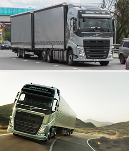
What makes a good photograph? Well, setting aside exposure and the technical side of things, it's all about composition. Take a picture of a lorry side on and, well, it's a lorry. Lay on the floor, shoot from below with a short focal length and you get something more – a dynamic lorry! Never shoot 'middle distance': get in close or step way back. A step or two to the side can change a composition beyond measure.
Post-production
Photographers love 'Lightroom', and running their photos through a myriad of filters. The end result can look great, but not always appropriate. If your subjects are primarily people, using post-production filters may not be a good idea. Getting the correct white balance is always paramount. But go easy on the Lightroom filters – and always ask your photographer for the unmolested files as well. If you have the original files, you can always return to them. One thing to note: most professional photographers shoot in 'RAW' format and only certain software supports that format.
The rule of thirds
Knowing, understanding and implementing the rule of thirds is a must. It is tempting to put the focus of a composition slap bang in the middle of the frame. Don't. Any composition will benefit from applying the rule of thirds. See right for an example. Position the element you want your viewers eyes to be drawn to, in the cross hair of the third and you won't go far wrong (there are exceptions, take the eel shot above). It is tempting to compose things by centring them in order to achieve 'balance'. That is a misconception.
Trust me.
Art direction
A good art director can change a good photoshoot into a brilliant one. While a photographer will be obsessing about light (they all do) an art director will see the bigger picture and will have insight about how the image will ultimately be used. Photographers will naturally frame and crop in camera. That can cause issues when a designer comes to use the image, sometimes rendering it useless. Art directors spot all sorts of things; that interesting angle, a plant 'growing out of a person's head' or that awkward line in the background. The photograph of the eel to the right comes alive when a blood orange is added, for instance.
Cropping
The simplest and most humble addition to a photographic project, cropping an image makes the world of difference. Don't forget you can crop at an angle and that can really make a portrait stand out. With a more traditional head shot, don't be scared to come in close and don't be afraid if the top of the subject's head is out of frame – it makes a dull image look great. Notice we used the rule of thirds to draw your eye in and make the portrait stand out from the page.
Rights and usage
The second the photographer clicks the shutter button, no matter what the subject is, they own the copyright. That is a fact. Unless you agree terms first. 'First' being the important word. It's best to stipulate what terms you want right from the outset, at the estimate stage. Typically a photographer will agree usage within in a region, in a type of media (editorial, for instance) and a fixed period. After that the photographer can use and licence the image elsewhere. If you want exclusive rights, worldwide and forever, you need to tell them. It is likely to cost you more, though how much more depends on your photographer.
Out of context
If the brief allows and the solution would benefit, a great device is taking your subject matter out of context. The shot in the masthead of this email of the eel benefits twofold; it's shot on reclaimed wood, which sets off and contrasts the finish of the skin. But the curveball, the blood orange, sets the whole thing off. This portrait of a chef, if it was shot in his kitchen, would not be such an arresting image – if it wasn't for the fish in his mouth. The same can be said for this portrait post-flour fight!
Stock shots and cliché
It's tempting to rely on stock photography as a quick solution to that image you need. It might even feel cheaper than commissioning your own. But 99% of the time a stock shot looks like what it is – staged and unrealistic. Of course stock shots do have their place and things have improved immeasurably recently, but use with caution.
Whatever you do, don't use images if you don't have permission. Libraries have software that scan the web for their 'watermarks' and you will get in trouble.
We charge £850 a day for photography, approximately, and £520 for art direction, definitely. What you get is unlimited and outstanding. Want to know more?


