Design miscellany A–L
This is the first of two emails in our ‘Design miscellany’ series. This is a collection of terms, comments and miscellany in alphabetical order with no other rhyme or reason other than to inform and entertain.
A
A is for ampersand, the correct name for '&' which is a cursive symbol representing ‘and’. It originates from the latin ‘et’ and in some fonts looks like an 'e' and 't' stuck together.
B
B is for ballpoint pen, where just one refill can draw a line up to 10,000 meters. First patented in 1888 by John J. Loud, it was László Bíró who perfected the design for the RAF.
C
C is for Chupa Chups, whose logo was design by the bonkers Salvador Dali, the Spanish surrealist artist. He suggested the logo move to the top of the lolly, not the side.
D
D is for duo tone, which is a way of reproducing a photograph in two colours.In the old days it was black and a spot (Pantone) colour and it was quite an art. These days you just click.
E
E is for ellipsis, the correct name for '...' An ellipsis donates something missing, and is a great way of editing a negative review to appear more... positive.
F
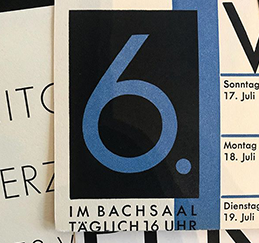
F is for Futura, a font design by Paul Renner in 1927. Its various famous applications are on the controls of a Boeing 747 and the font used on the plaque left on the Moon.
G
G is for Graphical User Interface (GUI), a very fancy term designers use to describe the way a digital interface looks, from your desktop or TV to your phone.
H
H is for Hicky, a blob you sometimes find on a printed document. It occurs when a speck of dust gets on the rollers – which really annoys the machine minders.
I
I is for IKEA, meatballs and all. Founded by Ingvar Kamprad (1926–January 28, 2018). Ingvar’s vision was to sell well-designed products for self assembly and he did it rather well.
J
J is for justification, when text is aligned on both the left hand and right hand of the column. There is no such thing as ‘left justified’ or ‘right justified’. The correct terms are ‘range left’ and ‘range right’.
K
K is for ‘black’, the ‘K’ used in CMYK. So why not CMYB? Using ‘B’ might confuse it with blue as well as the fact that black is used to register the other colours and is called the ‘key plate’.
L
L is for Ligature – not something you hang yourself with, but special characters typographers use that elegantly ‘join’ two or more letters together to avoid ugly crashes in headlines.


