Adding impact to your annual report — Special finishes
If you have read the article Adding Impact to Your Annual Report: Print and Binding, you will know I have saved the ££££ cost options for adding something special to the print production of your annual report.
Before I do, it may be apparent that we are a London-based graphic design, marketing and digital agency. So what? Well, we work across the globe, in the US, Spain, Italy, Bedford and Kettering and we deliver printed annual reports all over the world. We can work with a local printer based in our client country HQ or ship anywhere in the world. So there are no barriers.
What can we do to add a sprinkle of stardust to any report, and these all vary in cost and all depend on print run. But as a guide here we go… but do bear in mind, some finishes come with an environmental impact, which we can advise on.
Lamination and Spot UV
Matt lamination (or gloss) adds a plastic coating to the cover to give it durability. Every cafe you go to has a menu with a matt lamination on it so that greasy fingers and wear and tear don’t destroy a printed piece. However, traditional lamination, a plastic coating, makes a document unrecyclable.
There are lamination solutions that are environmentally sustainable and as part of our environmental standards, we deliver them. The only issue is communicating this to the recycling plants so that they know our finishes pash muster (it is the same with folding, more on that later).
Spot UV is a process of selective highlighting using a gloss (sometimes matt) coating. We used this to great effect with the City & Guilds Annual Report. Anyway, it is a great effect, doesn't cost that much just make sure the environmental impact is dealt with.
Foil blocking
If you want to highlight something in silver or gold, foil blocking is the way to go. But it isn’t just silver and gold, you can be more creative, black on black, white on black, the options are amazing. Standard techniques are not recyclable, but we do have a solution that is.
Die-cutting
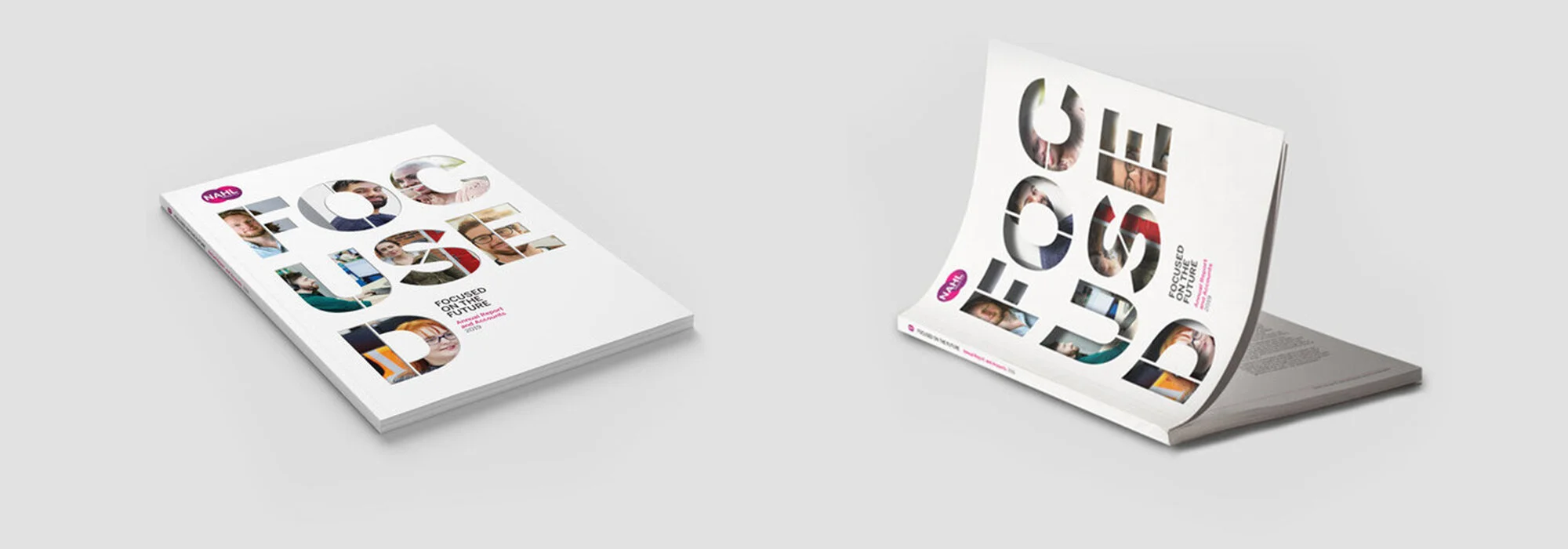
Cutting holes, shapes and different pages sizes make a report feel interactive. With the BPHA Group PLC annual report, our brief was to connect the homeowners and BPHA properties. We did this by die-cutting the people who actually live in their homes, over the homes and the stories they had to tell. The die-cut made that visual connection (we did it digitally as well) between the client and their homes.
Embossing and debossing
By pressing in or out type into a sheet of board creates a tactile, quality feel. Always used indiscretion moderation, nothing adds more to a report. However, this is a handmade process, so some bloke (or lass) has to hand press this into each and every cover. It takes time and craft. Depending on who you buy it from it can cost a fortune, or not.
Stock changes
What can make a report very tactile is switching from coated paper to uncoated paper? However, you will end up with a ‘flatter’ print quality that does not suit everyone. The final document will have more bulk and feel much more substantial.
Personalisation
With modern digital print it is reasonably easy and non-cost prohibitive to personalise the report in some way. A few ideas include printing the recipient name on an opening introduction section or a printed brand/wrap around the cover.
These techniques do not necessarily have to cost a fortune, they can make a real difference to the finished printed job. One thing to bear in mind is how to simulate the finish when delivering the online PDF version of the report.

