Designing an exhibition requires an understanding of the size and space. In this instance, it is a big space. The designer must set up the artwork with certain considerations in mind.
We set up the templates to include an indicating line that shows where the average person’s eye line falls. Another line demonstrates where the top of the plinths will sit.
BIDs operate within a defined area to enhance the district beyond what the local authority can offer.
What makes them different, to my mind, is that they are paid for by the businesses to work for the businesses, solely where they operate.
True story; an esteemed client came to us the other day with a sustainability report one of their consultants had written and presented to them. Let’s just say the client's feedback to the consultant wasn’t positive. I won’t quote the feedback as this is a family blog.
Any design agency worth its salt will bang on about the importance of being consistent on how a brand or corporate identity is applied.
It is important. Here’s why.
Launching a new company is an exciting time for everyone involved. It’s tempting to try and save money and do a bit of DIY branding – we understand that – so here are five steps you should consider to get your new brand in the best possible place.
I realise this might sound like a really stupid question – but it isn’t. The question is deceptively simple, after all, we provide graphic design services, right? Right, but you may think that designing logos, brochures, annual reports – all that stuff – is all we do. But we do so much more.
When you design a PowerPoint presentation, you want to get and keep that attention. Your aim should be to leverage the world's most lucrative currency to meet your objective. A well-designed PowerPoint has the power to captivate an audience by simplifying complex subjects and creating visual aids for composite data. It can persuade and engage, validating your topic.
After great success in London, Navig8 is opening an annual report design agency and graphic design agency in Liverpool.
Rebranding an organisation that has some perceived problems can present opportunities and pitfalls. All brands have inherent brand equity, good or bad.
Using three diverse examples. let’s discuss the advantages of a timeline for an annual report and stakeholder communication.
Icons, icons, icons – they are everywhere. We get requests for icons all the time; for annual reports, infographics and branding, to name a few.
We have established that the CMYK has a smaller range of colours. So start by selecting your colours in CMYK. Get a high-quality print test sheet run, on both gloss/silk and matt/uncoated stock first. Whilst you are at it, produce a printed test sheet with all the percentage tints on it as well, it will give you a really good overview.
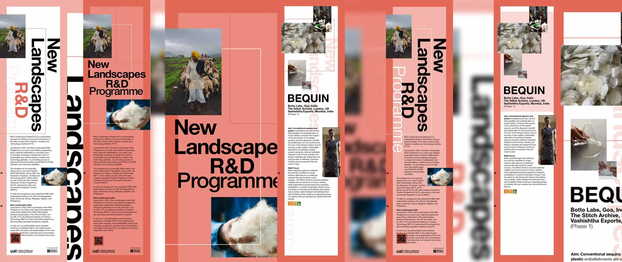
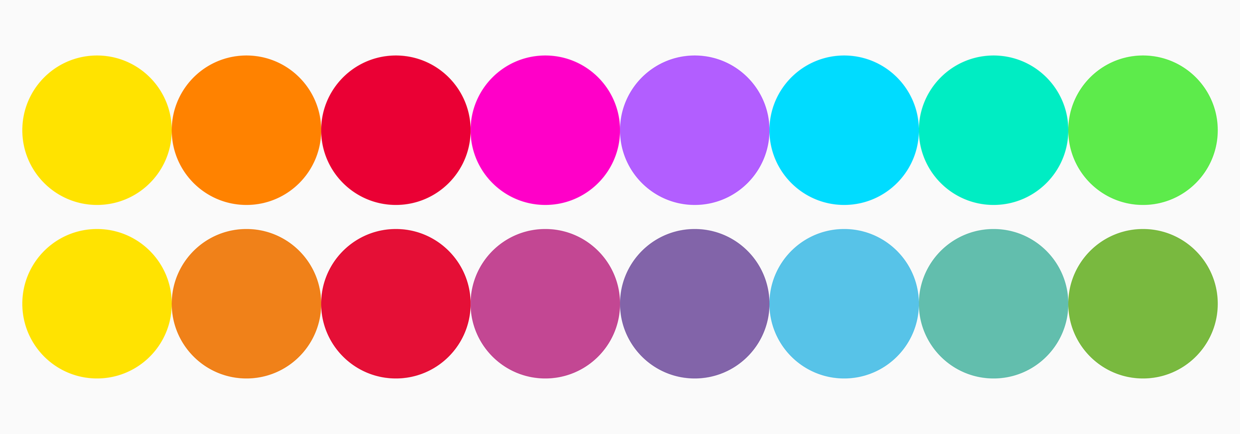
Bringing together a brand’s colour palette and applying them in a consistent way is one of the pillars of a strong identity. It is a big subject, here we touch on why they are important and what you might want to consider when putting a branding palette together.
When you engage a branding agency, whether it is for a rebranding exercise or a new branding project, the agency should be asking you some important questions before establishing the brief.
Design agencies offer a wide range of services these days – they have to, in order to compete. The benefit of using one agency rather than a number of specialist companies to deliver your design and marketing is that an agency that can deliver integrated services will take a holistic approach, make sure the left hand knows what the right hand is doing and save the client money.
Some brands, like, Ford, Coca-Cola and Boots have retained the original logo design from their very conception, or thereabouts. Having said that, all of them have been through subtle branding exercises. These subtle changes are to gently modernise the identity.
Some organisations have made a more drastic change. This might mean a change in name and a complete rebrand from the logo upwards.
Branding gets used to describe a visual identity for a product or service. It often relates to a wider application, rather than just a logo and colour palette for instance.
The actual term for this part of a brand is ‘corporate identity’. A corporate identity is the visual elements a company uses to identify itself.
In this article i set out what a mission, vision statement does, how an organisation can use a descriptor and what a lift speech is. We help organisations establish these as the bedrock of their brand values. This article is an edited piece from my forthcoming book, know your onions: corporate identity.
This then is the second and last in our series of ‘Design miscellany’ series, from M–Z. Nothing more than random comments, explanations and observations to inform and hopefully entertain.
Working with luxury brands and services requires a shift in communication mind set. You are no longer required to speak to the masses, but to the few. Often your market is more demanding and harder to impress. You must understand what is important to them and your aim is to communicate the product or services in a light that makes it a 'must have'