Drinks Marketing
Drink it in
Sometimes you get a dream client. Something you'd just love to work on. In my case, this is the historic and global brand Barbadillo. I'm a Manzanilla drinker myself. It's a very dry sherry, made in a tiny area of Spain. Having visited the winery (Bodega) in the interests of research – I changed my view of what a drink's brand is and what it takes to make something unique. Let's look at the best.
Schhh you know who
London Gin is famous the world over and despite a myriad of 'craft' gins and 'quality' usurpers, Gordons is the bottle that sits on your Mum's sideboard. It's not the font, it's not even the taste – it's that green, flat-faced bottle that we reach for. The marketing masterstroke came in 1965 with Schh you know who for Schweppes and their tie up later withGordons to create the 'ultimate' G&T.
If it ain't broke...
One of the great marketing disasters of the 20th century has to be Coca-Cola's announcement that they had changed the recipe in 1985 (the original from 1886) and announced Coke New. John Pemberton turned in his grave and 40,000 people wrote to the company complaining. Pepsi seized on the faux pas with the 'blind taste test' and gained a charge in the market. Coke backtracked sharpish. I always drank Panda Cola myself.
New kids on the block
Craft beer is the new kid in town, as long as you have tattoos, a beard and ride a fixed-wheel bike. Setting aside taste – and it is good (I've got the beard), Camden Brewery got it right from day one. They use bold branding, innovative naming (who'd of thought Hells was a good idea?) and a tone of voice that speaks volumes.
It sold for £85 million in 2015 by the two blokes who started it. Stroll on.
Can someone move that castle?
You know you see those cliché images of old men with handlebar moustaches sampling wine out of aged barrels and you think, 'yer right'. Well, having visited Barbadillo's Bodega in Sanlúcar, I can tell you now, they are genuine. There were no steel vats and machines here. The thing that really amazed me was this. Fino is made by the barrel full, literally. But to make Manzanilla the barrels have to feel the wind blowing off the sea, without that wind, it remains Fino. The bodega I visited, they stack the barrels high. This is because the castle behind the bodega blocks the wind coming from the mountains and without that wind, there is no Manzanilla.
The boys with the black stuff
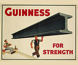
Guinness is almost as famous for its advertising as it is for its stout. For me, it started in the 1930-40s with John Gilroy's commission by the agency S H Benson. In those days products were often sold for their 'medical' benefits, Lucky Strike cigarettes boasted that Physicians agreed their brand was less 'irritating'.
Guinness over the years is one of the few companies that have managed to leverage creativity to its highest standard - you can watch the 'best' here.
Just add ice
Back in the 80s cider was a drink a chap would drink out of a brown paper bag on a bench singing "I am a cider drinker " by the Wurzels. Bulmers, the Irish cider branded as Magners in the UK, dropped some ice into the glass in 2006 and cider became the 'new chardonnay'. In a masterstroke they liberated the cider market by changing the way it was served. Buy one in any pub today and you don't even have to ask for ice. Just by changing the serve, the perception of cider changed. Can we do that for sherry?
Left on the shelf
Like all things, alcoholic beverages are subject to changes in fashion. Few brands survive to become a classic and long-term sitter on the sideboard.Blue Nun with your fondue anyone? Mateus Rosewas very popular in the 70s (and with Saddam Hussein) but now...? Wine hit the UK market in the 70s, before that it was stout or IPA with your prawn cocktail. This was when a glass of tomato juice was considered a 'starter'. What was 'all the rage' at the time soon becomes a source of ridicule. Aperol Spritz anyone?
Those iconic rings
Off topic for this post, but on topic for the Rio Games, here's a little aside on the Olympic logo.
The five interlocking rings represent 5 world continents, Africa, Asia, America, Europe and Oceania.
The logo was designed in 1912 by Baron Pierre de Coubertin, co-founder of the modern Olympic Games.
It is by any standards a brilliant logo. Abstract in its conception. Imagine if the Baron had tried to design symbols of athletes at 'work', We would have ended up with a dated mark, worthy of every leisure centre in the UK.
We promote sensible drinking at all times, particularly if it is with us. If you fancy a beer... let us know!
Any marketing and design subject you'd like us to tackle?


